

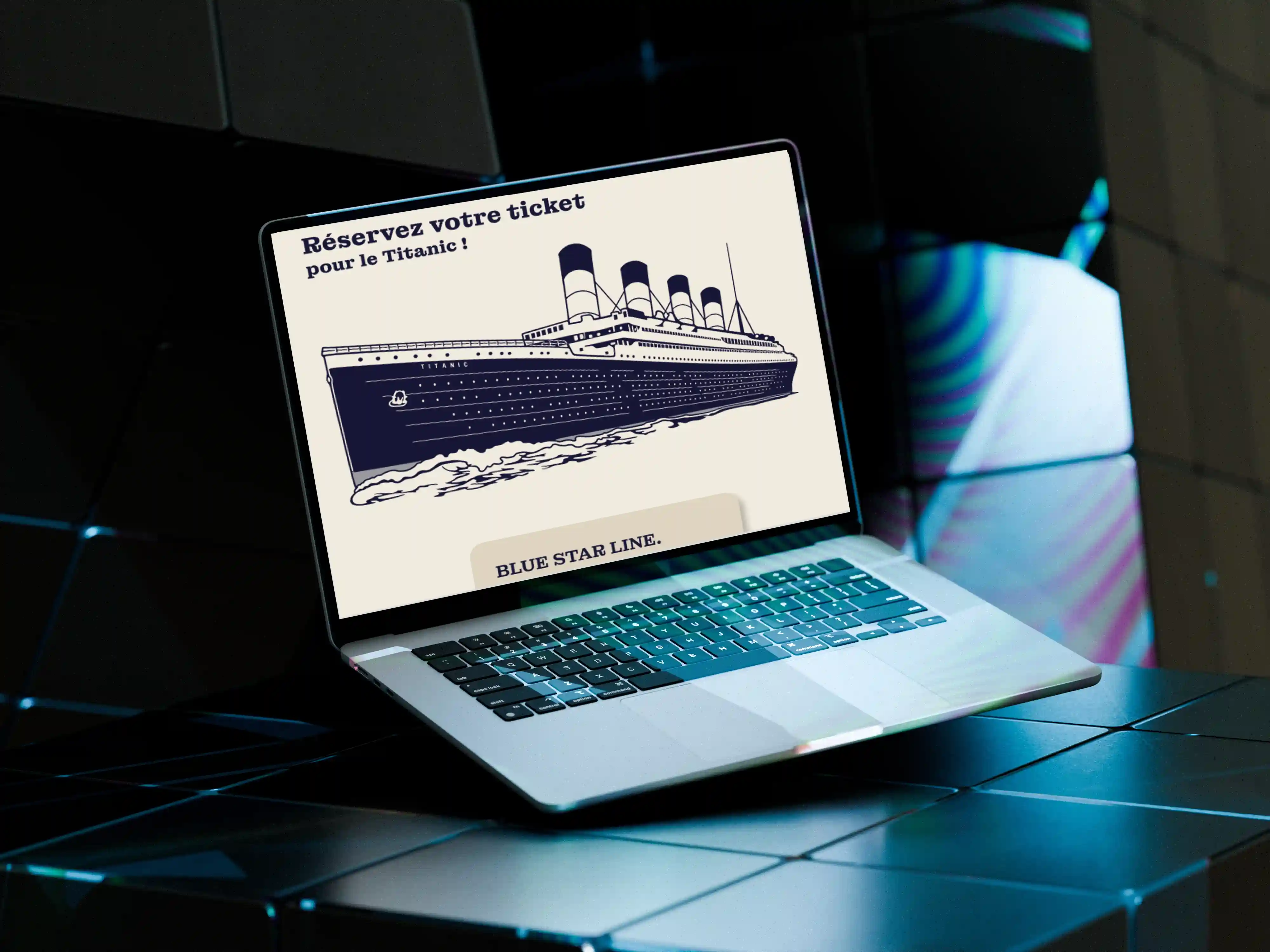
As part of a workshop at Haute Ecole Albert Jacquard, we were given a challenge: choose a JSON dataset — either found or created — and design an interactive interface around it.
With my team, we went for a classic (and let’s be honest, a bit of a tragic) dataset: the sinking of the Titanic. The topic felt like an obvious choice because it mixes history, statistics, and that morbid curiosity we all secretly share.
Our main goal was to create an immersive and educational experience without drowning the user in data.

The user starts by booking a ticket. Social class, gender, age... everything matters!
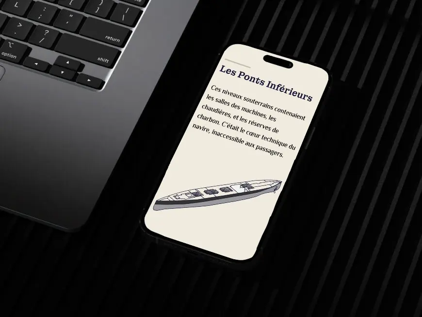
Once on board, they can explore (virtually, of course) the ship’s different decks while discovering survival statistics based on passenger profiles.
And the best part? At the end of the journey, their personalized survival rate is revealed on the back of their ticket. A little grim, perhaps, but definitely unforgettable!
This project was a real technical challenge. I started with only basic knowledge of JavaScript, but I managed to build a working interactive interface, developing a large part of the logic behind the experience.
I also got to use one of my key strengths: storytelling, which guides the user throughout the journey.
Cherry on top: I designed the poster for our presentation stand — a way of saying ‘’look at us’’ without having to shout.