

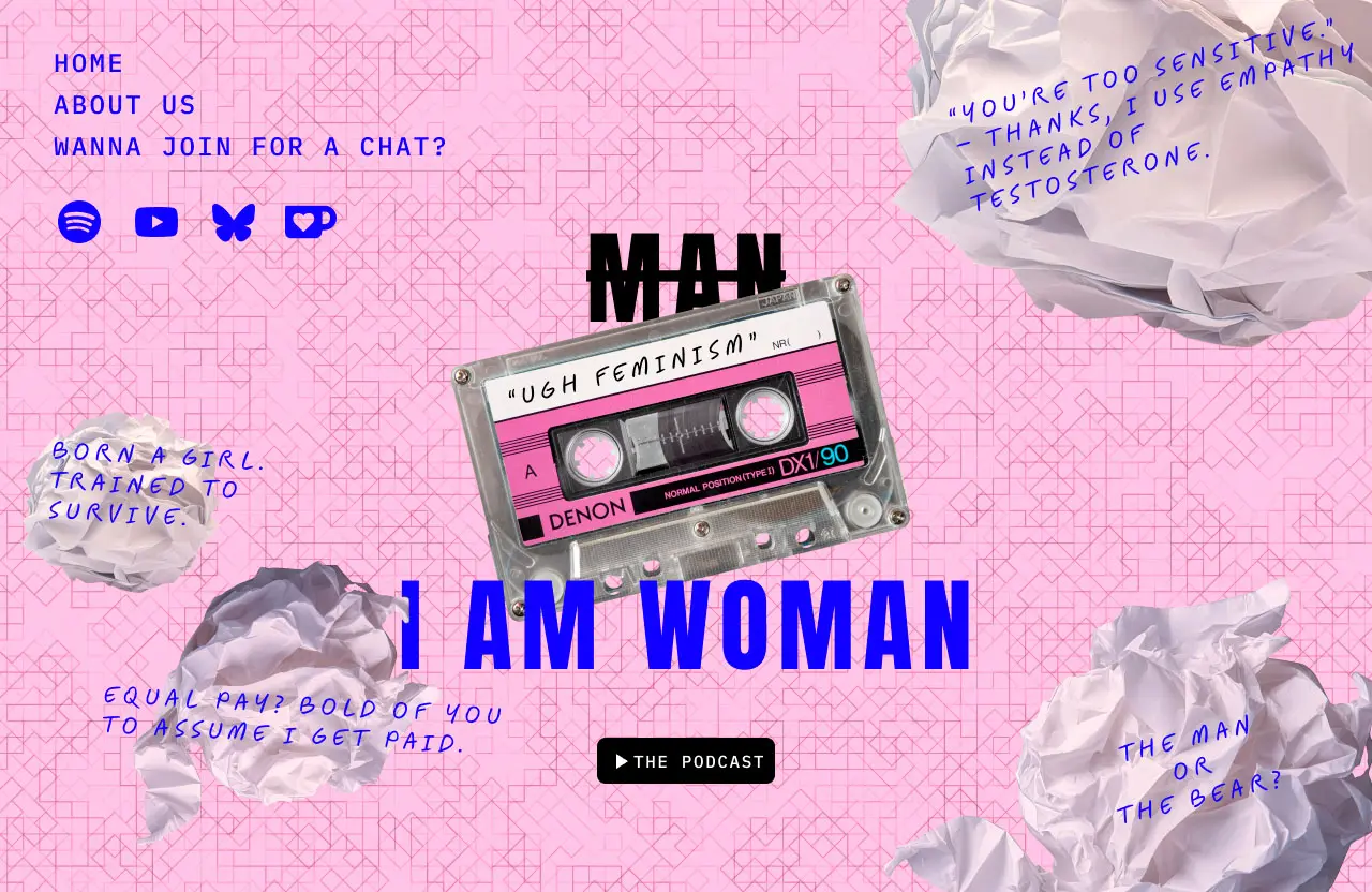
In our last UX/UI class, we explored the basics of brutalism in web design—a raw, direct style often seen as a form of anti-design.
After this crash course, we were given a challenge: design a landing page in one hour, using the brutalist style.

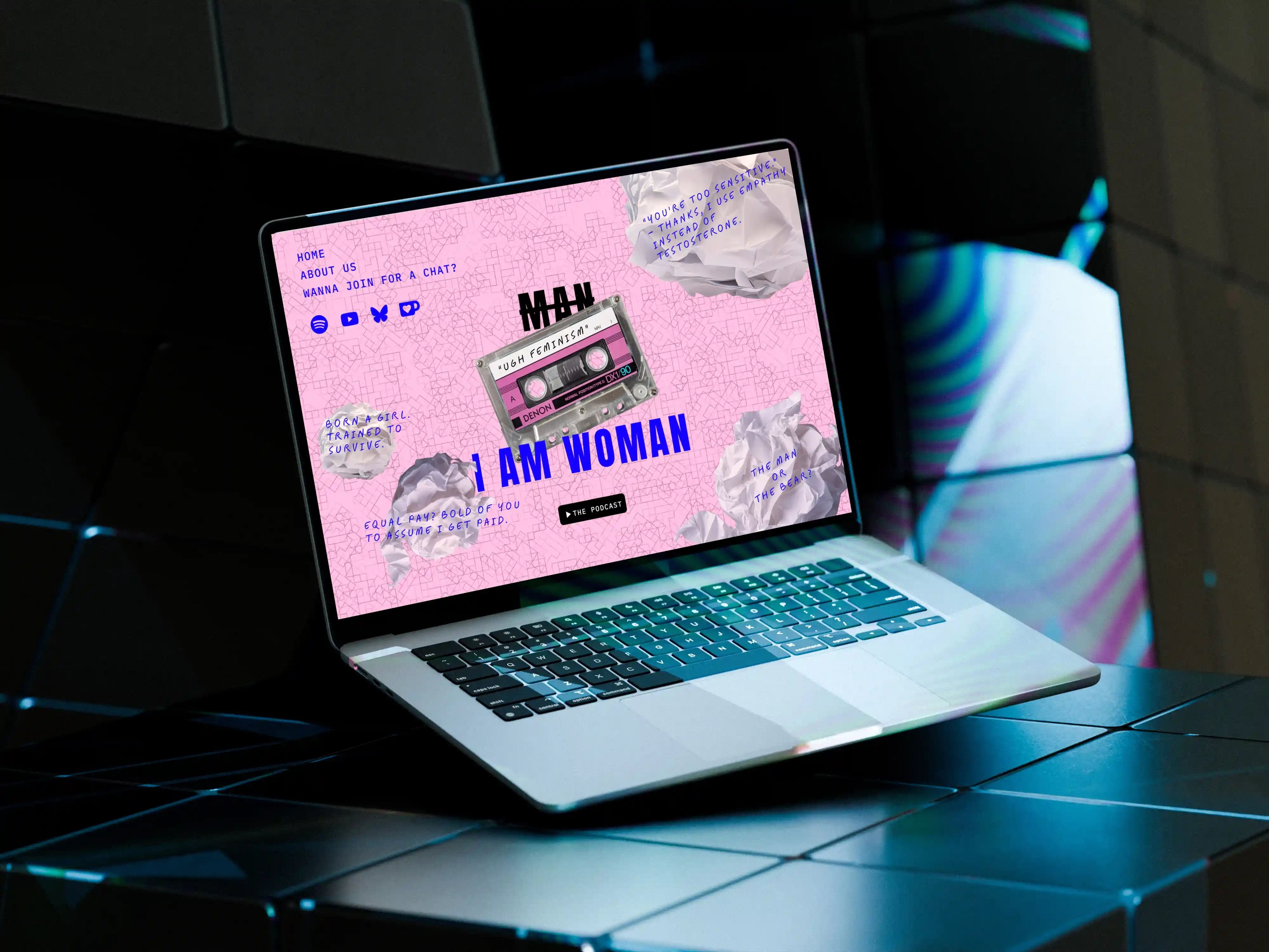
Among the suggested themes, I chose to focus on a feminist podcast, a subject that resonates personally with me. My goal was for the design to speak for itself.
Given the tight time limit, I aimed to be as efficient as possible. I used Adobe Stock’s image gallery and quickly adjusted the colors to match a deliberately bold and contrasting palette. Everything was laid out with maximum impact in mind.
I jumped straight in, without looking at any references—wanting the result to feel as authentic as possible.
This challenge reminded me that design doesn’t have to follow the rules. What matters is that it works, that it says something.
And honestly?
Design is kind of fun.